In digital art, color plays a pivotal role in capturing attention, conveying emotions, and shaping the overall impact of a design. Whether you’re a seasoned digital artist or just starting, understanding and harnessing the principles of color theory can significantly enhance your creative journey.
With the right knowledge and approach, you can infuse your artwork with depth, meaning, and visual harmony.
Color theory forms the foundation of art and design, encompassing the study of colors and their relationships. By exploring the science and psychology behind colors, artists gain a powerful toolset to communicate and evoke specific emotions and messages within their creations.
In this comprehensive guide, I will delve into the world of color theory and its application in digital art.
I will uncover the basics, such as the color wheel, primary, secondary, and tertiary colors, as well as more advanced concepts like color palettes, harmonies, and contrast.
Let’s embark on this enlightening journey to discover how you can utilize color theory to elevate your digital artwork and create visually striking masterpieces.
Understanding the Color Wheel
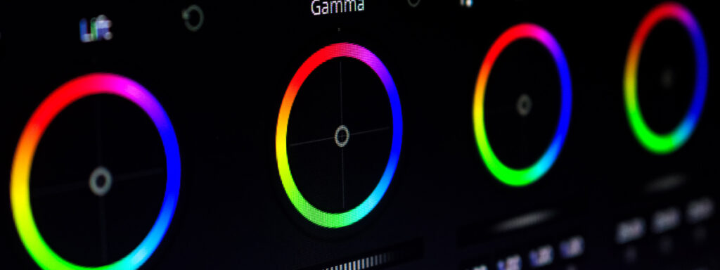
At the heart of color theory lies the color wheel, a visual representation of the relationships between different hues.
The color wheel consists of twelve main colors, which can be categorized into primary, secondary, and tertiary colors.
Primary colors are the foundation of all other colors and cannot be created by mixing other colors.
Primary colors include:
- red,
- blue,
- and yellow.
Secondary colors, on the other hand, are formed by mixing two primary colors.
Secondary colors include:
- green (blue + yellow),
- orange (red + yellow),
- and purple (red + blue).
Tertiary colors are the result of mixing a primary color with a secondary color.
The arrangement of colors on the color wheel is essential in understanding their relationships and how they interact with each other.
The wheel is divided into warm and cool colors, with warm colors, such as red, orange, and yellow, evoking a sense of energy and vibrancy, while cool colors, like blue, green, and purple, create a more calming and soothing effect.
Color Palettes: Creating a Harmonious Ensemble

Now that we have a grasp of the color wheel and its components, let’s explore the concept of color palettes.
A color palette refers to a set of carefully selected colors that work harmoniously together within a design.
By using a well-curated palette, artists can evoke specific moods and ensure visual coherence in their artwork.
When creating a color palette, it’s crucial to consider the emotions and messages you want to convey.
Each color carries a psychological impact. For example, red symbolizes passion, energy, and urgency, while blue represents calmness, trust, and reliability.
By choosing colors that align with the intended mood or theme of your artwork, you can create a stronger connection with your audience.
There are various approaches to selecting color palettes.
Analogous Colors
One popular method is analogous colors, where you choose hues that are adjacent to each other on the color wheel.
Analogous palettes create a sense of harmony and are often used for designs aiming for a cohesive and peaceful ambiance.
For example, combining different shades of blue and green can result in a tranquil and refreshing composition.
Complementary Colors
On the other hand, complementary colors are those positioned opposite each other on the color wheel.
These combinations provide a striking contrast that can be highly effective in creating visual impact.
For instance, pairing yellow with purple or red with green can produce a vibrant and energetic composition.
Triadic Colors
Triadic color schemes involve selecting three colors evenly spaced around the color wheel.
This approach offers a balance between contrast and harmony.
By using triadic palettes, you can create dynamic compositions that capture attention while maintaining a sense of unity.
In addition to these methods, artists often draw inspiration from nature, art movements, or even existing color schemes to build their palettes.
Online tools and applications such as Adobe Color and Coolors are dedicated to color palette generation and can also assist in finding harmonious combinations that suit your artistic vision.
Using Color Harmonies to Enhance Visual Flow

To further refine your digital artwork, it’s important to understand and leverage color harmonies.
Color harmonies are specific combinations of colors that create pleasing visual effects when used together.
By utilizing harmonies, you can guide the viewer’s eye through your composition and establish a sense of balance and unity.
Monochromatic Scheme
One widely used color harmony is the monochromatic scheme, which involves using different shades, tints, and tones of a single color.
Monochromatic palettes provide a clean and sophisticated look, as well as a sense of continuity.
This scheme is particularly useful when aiming for a minimalist or elegant aesthetic.
Analogous Scheme
Another popular harmony is the analogous color scheme, mentioned earlier in the context of color palettes.
Analogous harmonies create a smooth transition between colors, making them ideal for conveying a sense of serenity or warmth.
By incorporating different shades and saturations of neighboring colors, you can achieve a cohesive and visually pleasing composition.
Complementary Scheme
Complementary color harmonies, consisting of colors directly opposite each other on the color wheel, offer a high level of contrast and visual impact.
When used strategically, complementary colors can create focal points and draw attention to specific elements within your artwork.
However, it’s important to use them sparingly and balance their intensity to avoid overwhelming the viewer.
Split Complementary and Triadic Scheme
The concepts of complementary colors are further developed through split complementary and triadic harmonies.
Split complementary harmonies involve using a color and the two adjacent hues to its complementary color.
This creates a vibrant and dynamic palette with a slightly less intense contrast compared to complementary schemes.
Triadic harmonies, as mentioned earlier, utilize three colors evenly spaced on the color wheel, resulting in a visually balanced and engaging composition.
Beyond these harmonies, there are additional techniques like tetradic (double complementary) and square color schemes that offer even more possibilities for creative exploration. These harmonies provide a rich color palette that can add depth and complexity to your digital artwork.
Harnessing the Power of Contrast
Contrast is a powerful tool in digital art that helps create visual interest, emphasize focal points, and enhance legibility.
Understanding how to effectively use contrast in color selection can significantly elevate the impact of your designs.
Value Contrast
One aspect of contrast is value contrast, which refers to the difference between light and dark colors.
By strategically incorporating light and dark tones in your composition, you can add depth and dimensionality.
For example, placing a light object against a dark background can make it stand out and become a focal point.
Hue Contrast
Another form of contrast is hue contrast, which involves utilizing colors that are far apart on the color wheel.
Hue contrast creates a strong visual impact and draws attention.
For instance, pairing a warm color like red with a cool color like blue instantly catches the eye and adds energy to your artwork.
Saturation Contrast
Saturation contrast focuses on the intensity or purity of colors.
By juxtaposing saturated colors with desaturated ones, you can create a sense of emphasis and balance.
For example, a highly saturated object against a desaturated background can create a striking focal point.
Textural Contrast
When creating digital art, it’s important to consider textural contrast. This involves incorporating various textures and patterns to create a visually interesting piece.
Textural contrast adds visual interest and can help define separate elements or areas in your composition.
By combining smooth and rough textures or intricate patterns with simple ones, you can create a sense of variety and depth.
When utilizing contrast, it’s important to strike a balance between harmonious cohesion and visual impact.
Too much contrast can create a chaotic or jarring effect, while too little can result in a bland and unremarkable composition.
Experimentation and iteration are key to finding the right balance that suits your artistic vision.
Conclusion
As you embark on your journey in digital art, understanding and applying the principles of color theory will open up a world of possibilities.
By mastering the color wheel, selecting harmonious palettes, leveraging color harmonies, and harnessing the power of contrast, you can create captivating and impactful digital artwork.
Remember, color theory is not a rigid set of rules but rather a guide that empowers you to make informed decisions.
Take the time to experiment, explore different combinations, and trust your intuition. With practice, you’ll develop a keen eye for color and be able to create art that resonates with your audience on a profound level.
So, go ahead and infuse your digital art with the magic of color theory. Let your creations speak volumes through the strategic use of colors.
If you haven’t already, check out the article, “10 Essential Tips for Digital Artists Just Starting Out” to learn more about the basics of digital art.
Elevate your designs, evoke emotions, and embark on a visual journey that captivates and inspires.
